Turning a new name into a recognizable brand
When Symmetria launched as an IT consulting and software development company, it had a name and no visual identity. It needed a brand that prospective clients would recognize and take seriously, and one that could serve as a foundation as the company grew.
- The identity had to establish credibility with prospective clients from the start
- It had to feel modern, confident and trustworthy without turning corporate
- It could not blend in with every other software company
- One identity had to work in digital products, on websites, in presentations and on business materials
Finding the visual idea behind the name
The process started with what the company stands for, explored widely, then built the strongest idea into a complete identity. The focus throughout was simplicity and versatility.
Positioning and meaning first
Before any visual work, the process looked at Symmetria's positioning, its personality and the meaning behind its name.
Many directions, one concept
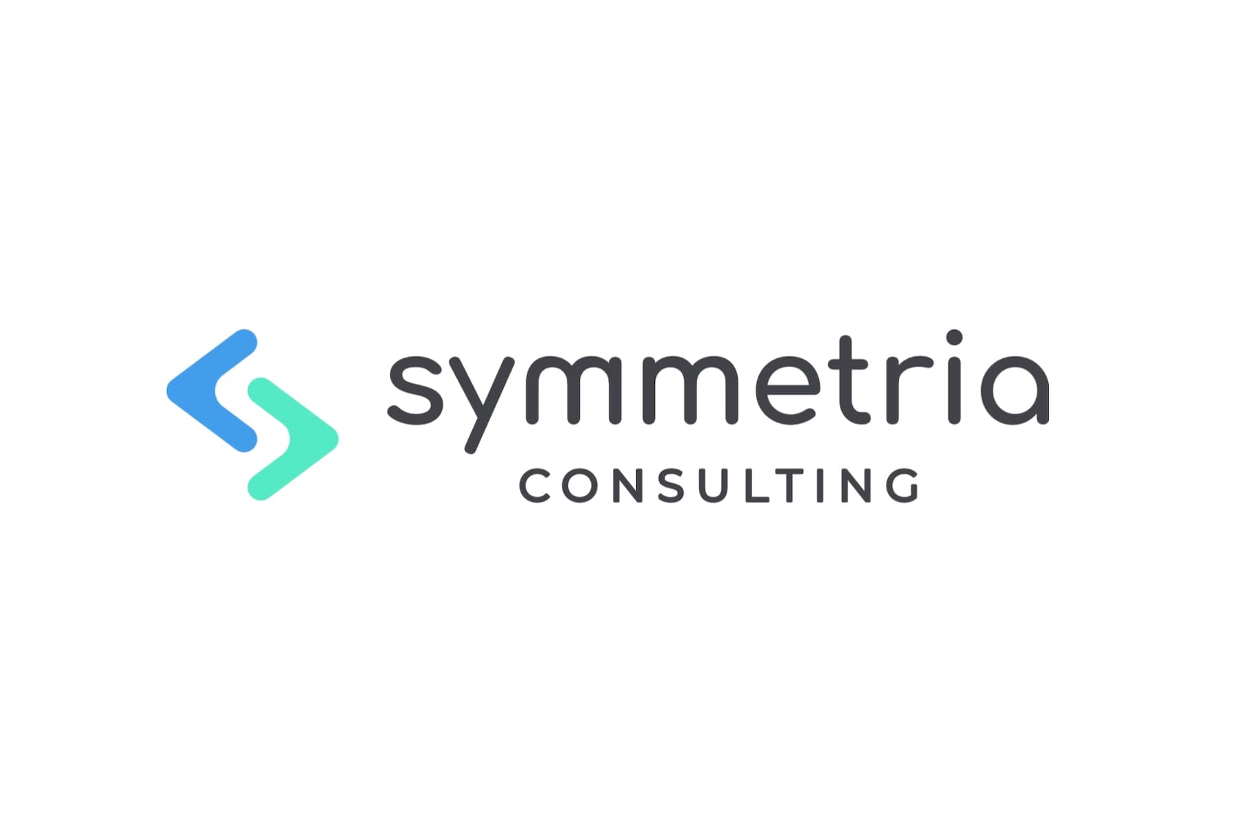
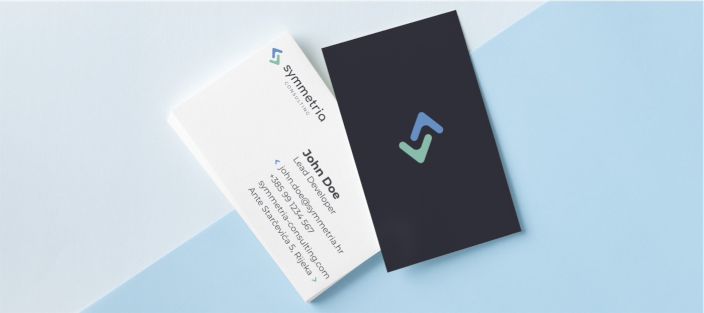
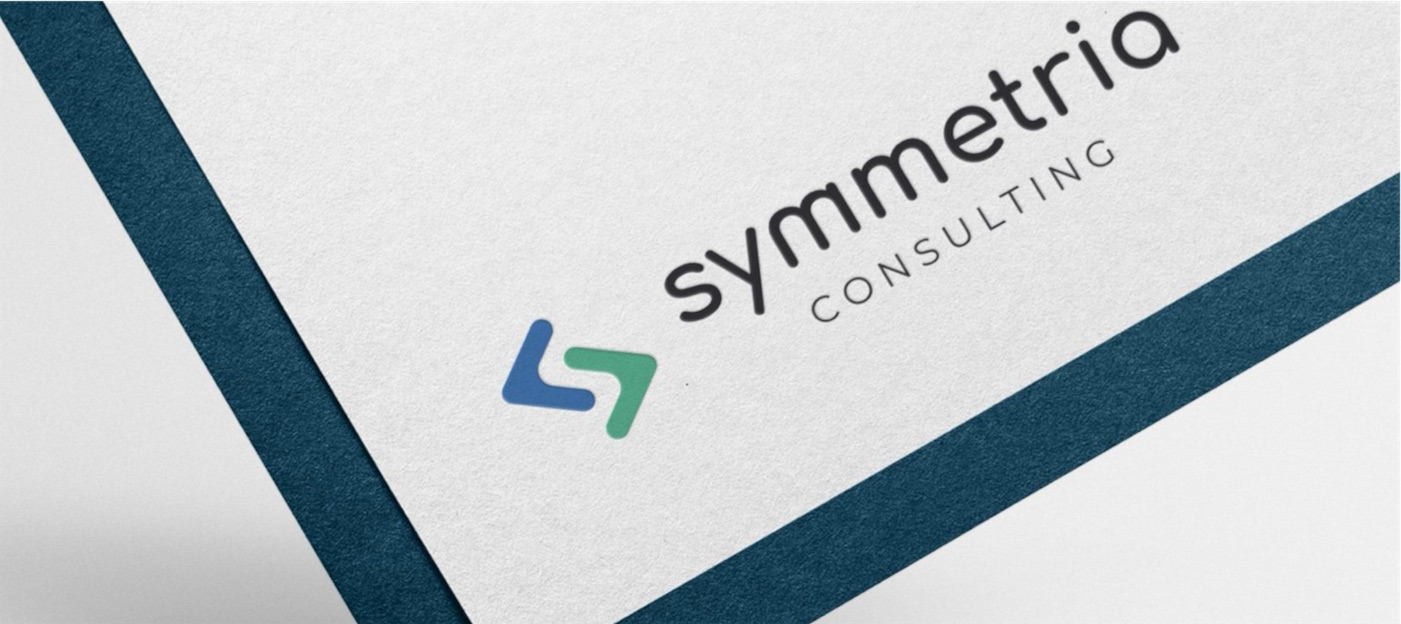
Different visual directions, symbols, typography and color combinations were explored side by side. The concept that went forward: two coding brackets whose negative space forms the S in Symmetria.
Simple enough to stay recognizable
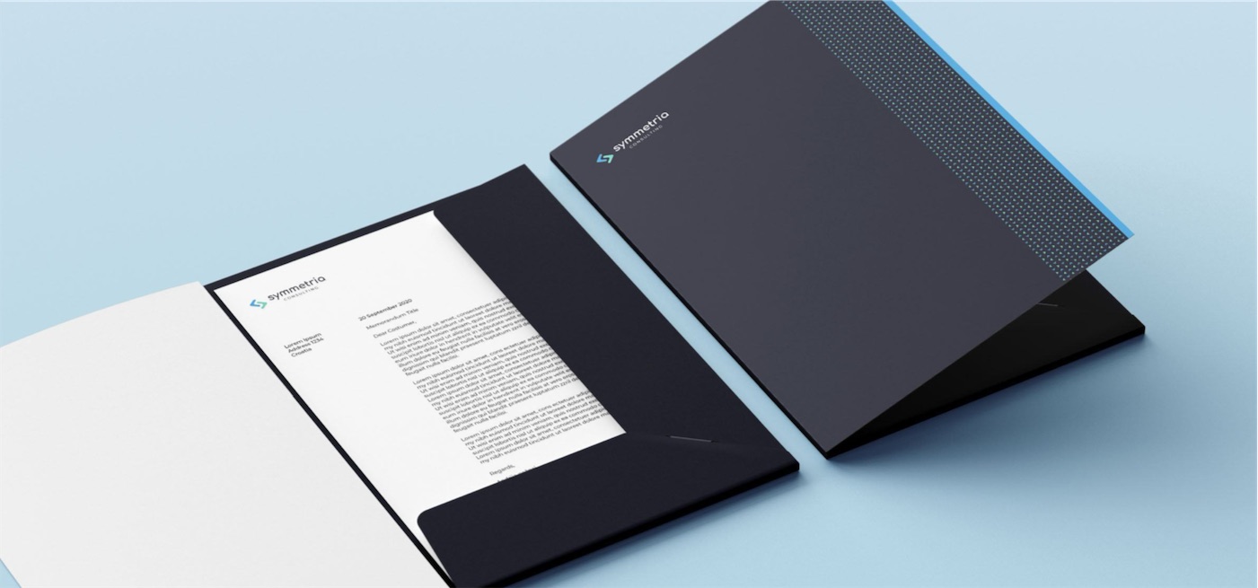
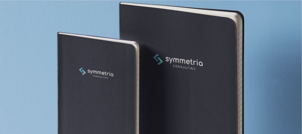
Simplicity was a deliberate choice, so the brand stays recognizable everywhere it appears, from digital products and websites to presentations and business materials.
A logo system with rules around it
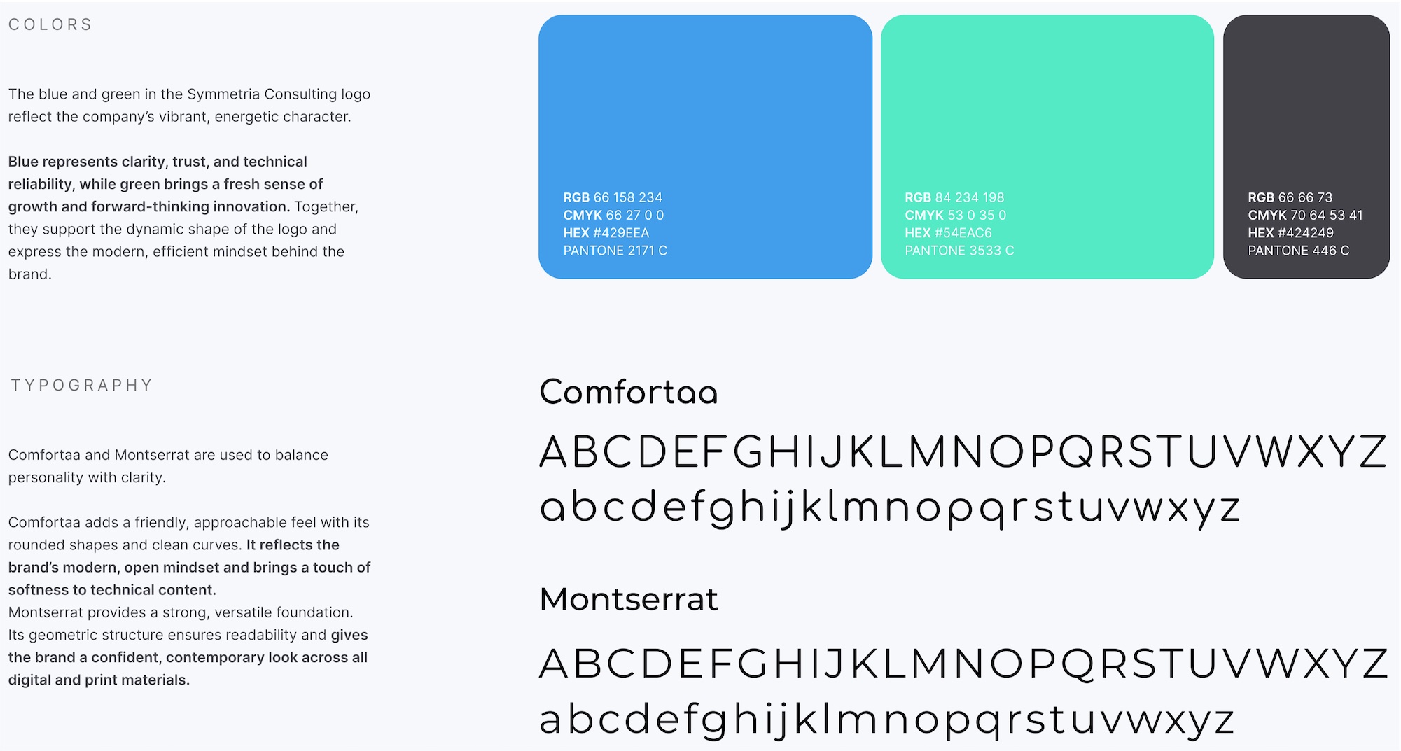
The logo was built out into a full system: blue for clarity and trust, green for growth, Comfortaa and Montserrat as typefaces, and brand guidelines for digital and print, so the brand stays consistent as the company expands.
What We Delivered
- Symmetria logo and logo system
- Typography
- Color palette
- Brand guidelines for digital and print use
A Closer Look
 (opens full size in a new tab)
 (opens full size in a new tab)
 (opens full size in a new tab)
 (opens full size in a new tab)
 (opens full size in a new tab)
- Launch to Today
- The foundation of Symmetria's visual presence as it grew into a software development partner for startups and enterprise clients
- Complete
- Logo system, typography, color palette and brand guidelines
- Digital and Print
- One identity, used consistently across both